
| Project Type: | Skills: | Timeline: | Tools: |
|---|---|---|---|
| Academic / Individual | Product Design, Ideation, UI Design | November - December 2022 (3 weeks) |
Figma, Figjam, Photoshop |
Since most colleges do not allow students to send packages in advance, students have to buy all necessities on move-in day. They face problems of necessities being out of stock and physical stresses like jet lag.
Dorm.it helps to solve the problem with a unique “schedule a delivery time” feature, with additional functions such as Dorm Checklist and Bed Visualizer helping college students prepare luggage and decorate their rooms.
Dorm.it was inspired by my messy move-in experience to the school dorm. While experiencing jet lag and the nervousness of living in a new city, I felt physically and mentally exhausted to handle many unexpected problems alone on the move-in day.
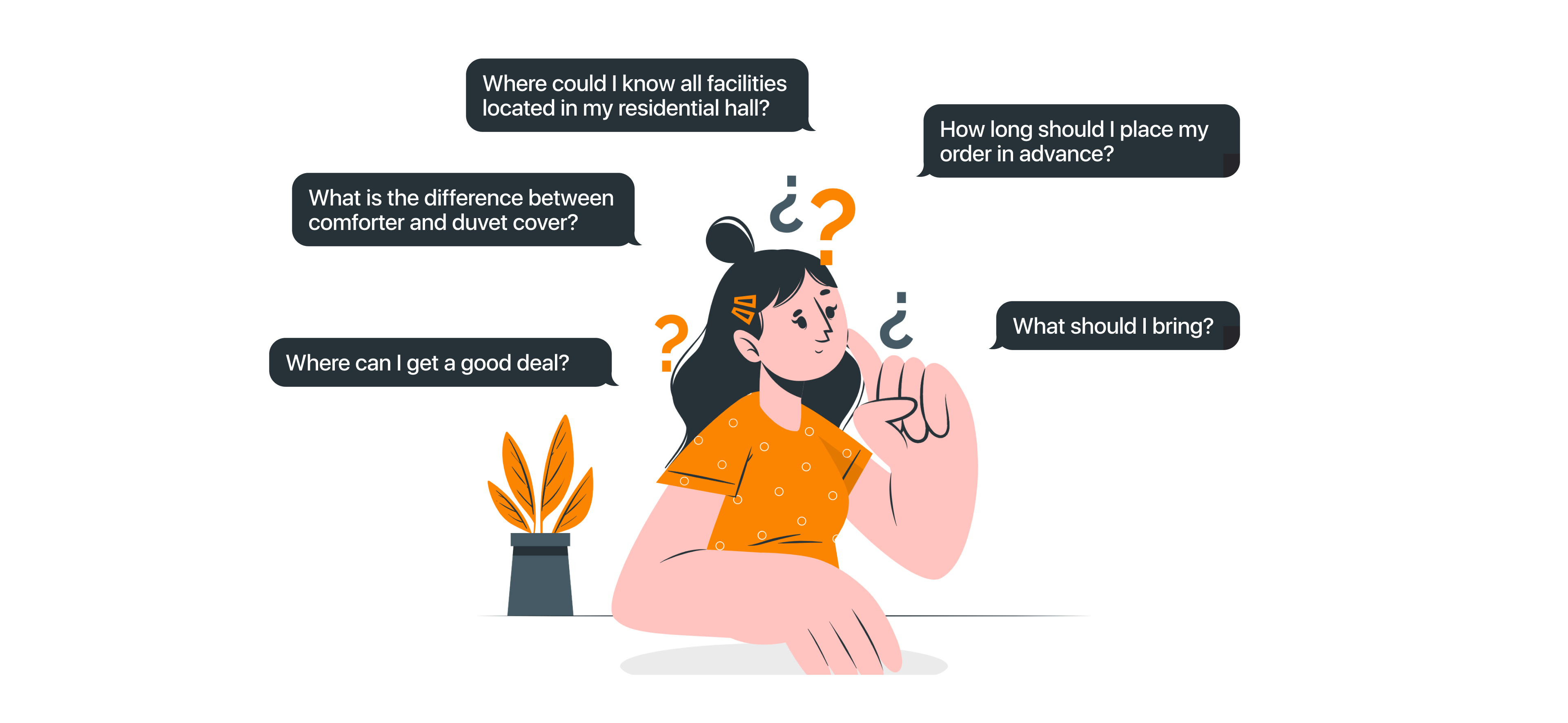
Looking back, I felt proud of myself to solve countless difficulties on my own, but I hope future students won't experience the same stress as me. Thus, I began brainstorming what kind of product could be helpful for students living on campus. Here're some of my initial ideas.

To validate my thoughts and explore more potential needs, I moved to the research stage.
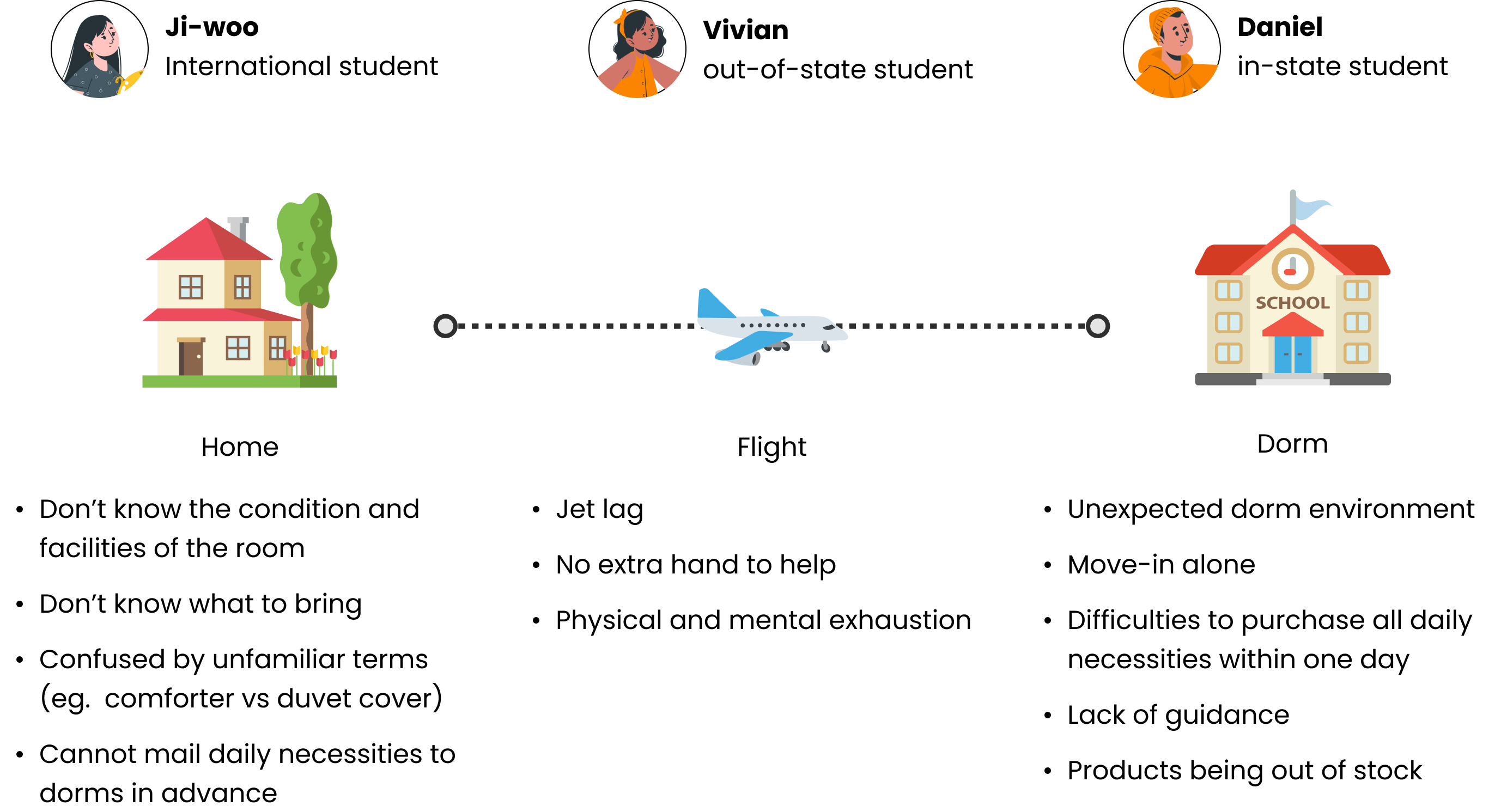
I conducted three interviews with students who live on campus for at least one academic year. When picking interviewees, I considered where they came from, as I believed in-state students, out-of-state students, and international students will have different move-in experiences and face different problems.
My interview proved this assumption. The interview indicated that students' difficulties centered on acquiring accurate information about room facilities, packing luggage, and buying all room necessities in a day.
The houseware market is a mature market where people can make easy purchases both online and offline. How does Dorm.it stand out and differentiate itself from its competitors? In my competitor research, I chose four representative platforms in different categories and focused on their services for the college student clientele.

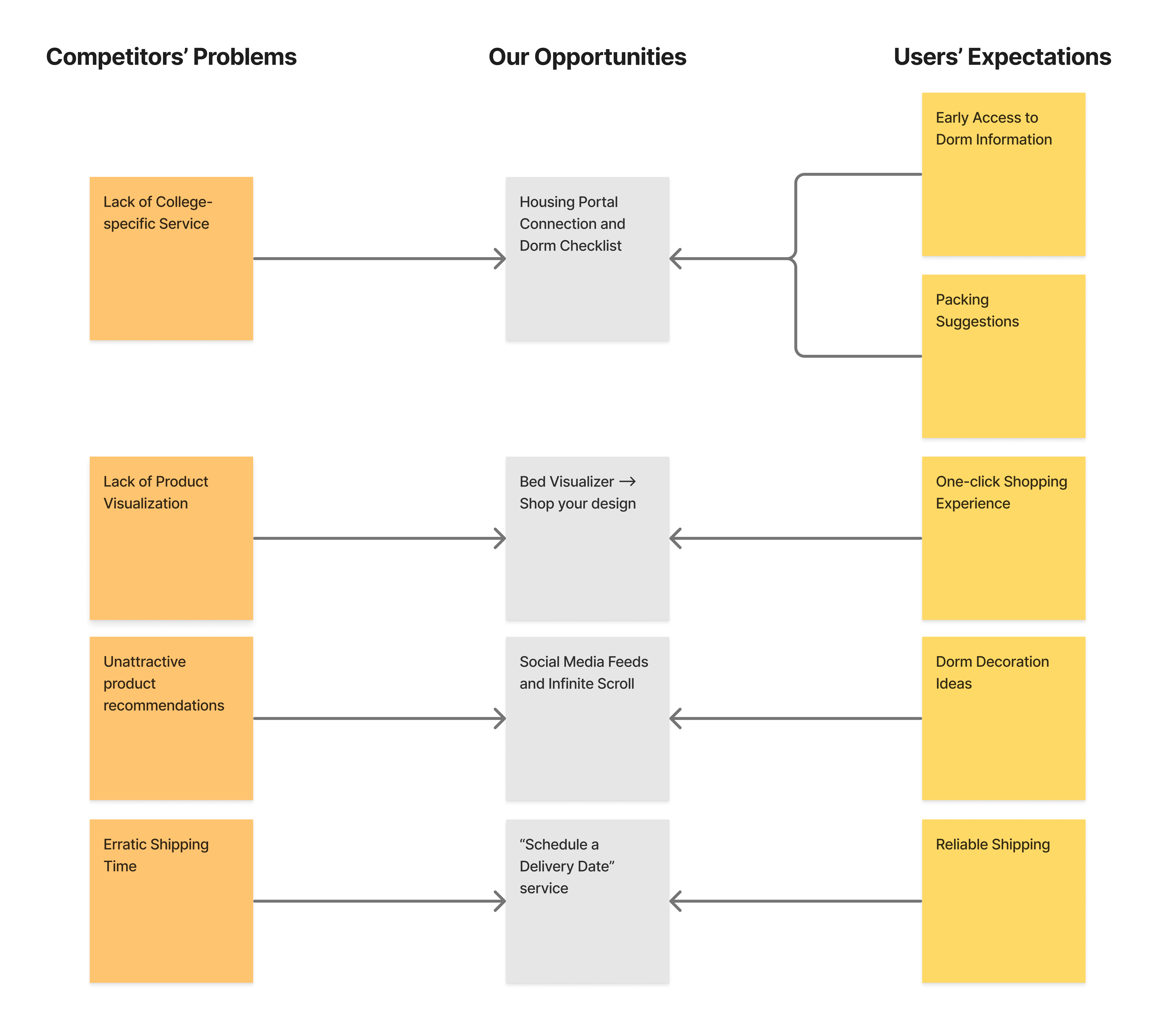
Here, I summarized insights from user interviews and competitor analysis to brainstorm opportunities for Dorm.it
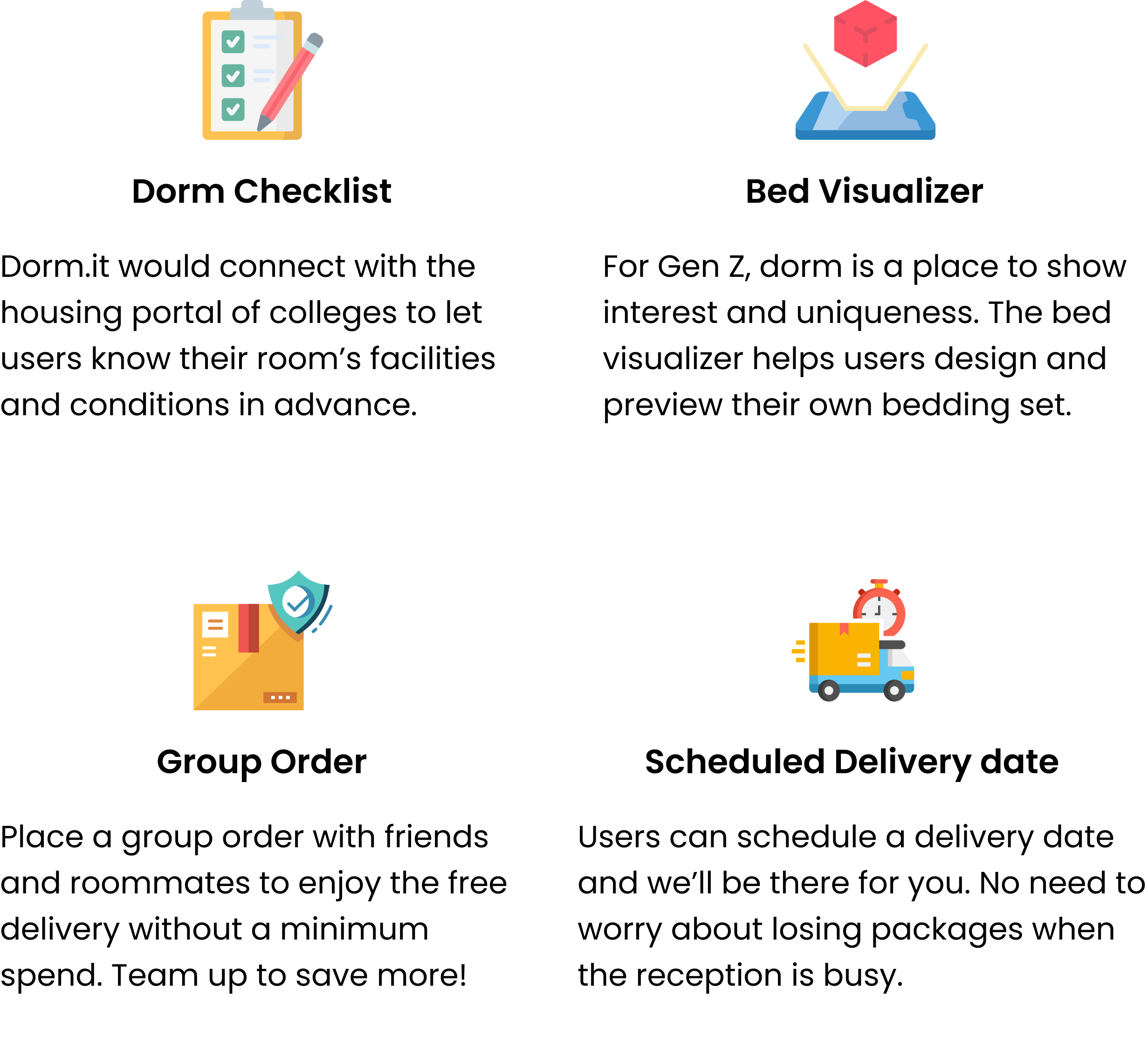
Based on the user research, I concluded main features of Dorm.it that can fit the market gap.
The following graph shows all other functions the app has other than key features mentioned above.
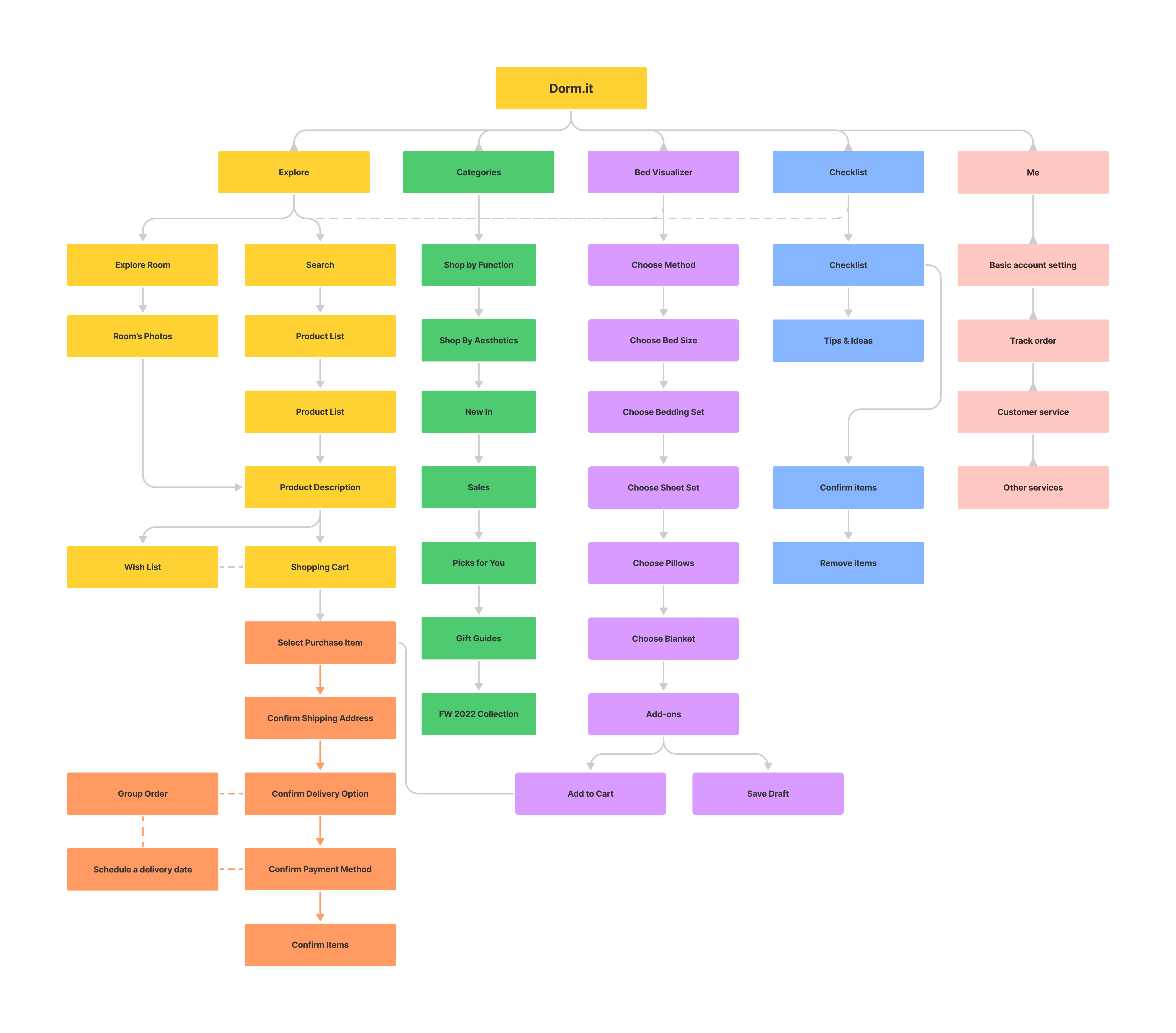
Based on the information architecture, I began creating wireframes of the product. The wireframes helped me identify essential interfaces of the app, also speed up my design. The following are some pages of the wireframes.
With the prototype, I started two rounds of user testing with different users. Then, I organized user feedback in a priority matrix. The chart helped me prioritize and complete design tasks that are important to user value within a limited time frame.

If I have more time, I wish to complete the following things:
Compared with other UX projects, Dorm.it is the most challenging one. I started with brainstorming a new product, and then conducted user research, designed, and continued iterating my ideas based on user's feedback. Here're some key takeaways from this project.